HOME | ABOUT ME | CV | WORK | RESEARCH
Clear Minds: Your Road to becoming stress-free
This app is designed for users who are facing some kind of emotional turmoil in their life, and are motivated to move ahead, and need a small helping hand.
The need for this product:
The COVID-19 pandemic, has us all cooped up in our houses. We take time out to exercise, relax, work. But no time is given to actually looking into our mental health. Humans are social animals and being indoors, essentially limits the physical social encounters to family members or flat-mates. Even though technology assists in easily keeping in touch with others, it is bound to have an effect on our mental health.
That is why, the idea of designing a therapist app came into mind; to give people the personalized care and support they deserve.
I investigated applications that pre-existed. I noticed that if an application has personalized care, it lacks any kind of progress tracking. This makes it difficult for therapists to efficiently monitor a person’s progress. Because there is no face-to-face meeting, there is a possibility that some aspects of the person’s actions and behavior have gone unnoticed, due to lack of a proper logging system (which traditionally used to be the therapist’s notes).
If the progress tracking is present, there are generally auto-generated therapy options that are recommended to the patient based on a questionnaire they signed. That got me thinking. Sometimes, patients do not know what exactly their problems are. This may lead to them filling out the questionnaire in a misinformed way. And the prognosis could only go downhill from there. Hence, this pitfall must be avoided. Even if this is not the case, it does not receive any interactive treatment. He/she is left to follow given instructions, which may or may not suit his/her needs.
Furthermore, if a patient is a bit doubtful of his/her progress, he has no option but to either abandon the process or keep trusting the therapist he/she is seeing and look for another one. Even the latter option shall be followed much later, when dissatisfaction is no longer bearable. Hence, if case of a doubt, there should be a second opinion to bank on, so that dissatisfaction can be weeded out fast, and if not satiated, the person is free to join another therapist. No time meant for precious progress is wasted.
Goal:
This application must focus on building a level of trust and rapport between the therapist and the patient, and must allow the therapist to have an idea of what the problem is, so that he/she can have a plan of action ready before interacting with their patient.
The patient too, should be able to decide if they are comfortable with the therapist, or look for another one, before starting their sessions.
This app must make the process of being a comfortable therapist-patient pair very easy and efficient.
Strategy:
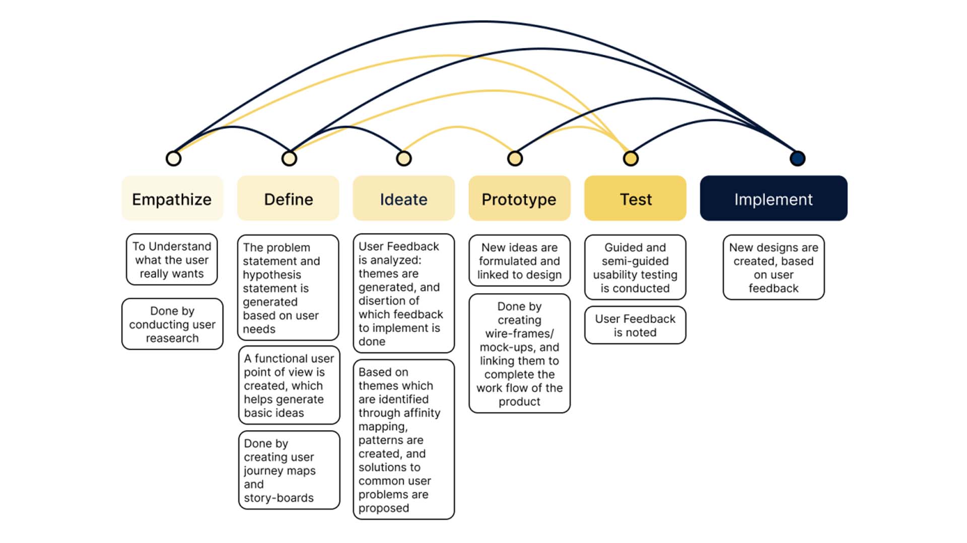
My initial strategy was to empathise with users, to get an idea of what the user truly needs. This would eliminate any biases that I might have about what should be present in the product, and help me objectively look at user needs, and generate a problem statement.
The next step that I took, was defining the problem statement, and a hypothesis statement, which I shall include below, in this case study.
After this, I ideated on various designs and features that must be present in the product, and how to present it to the user in the simplest way possible. Then I generated prototypes, which were to be deployed for testing with the users.
I conducted interviews with the participants, and asked them to provide feedback, and explain what they would like or want me to omit in the application. Furthermore, I went on to analyse feedback, generate themes within the feedback, and decide which feedback points were a must for implementation.
User Research:
I conducted user interviews. Before entering into the interview process, I had an assumption, that my users will have certain emotional baggage, since they are looking for a therapist. They might not be completely open about their needs, and may not e ven have a complete notion of what they need.
I conducted them for a varied age-group, which I categorised into student, started working, working, retired. I realised, that a more deep rooted need for a therapist came in the middle two classes, not that the need was lesser in the remaining, it was less desperate. I realised that my assumptions were somewhat right, and I also followed, that the need for personalised care was a must for all demographics. The users wanted their therapist to be prepared, and to know of their woes, and be able to provide them with easily implementable solutions (which might be a bit of a pipe-dream 🙂 )
The process of opening up, trusting and being comfortable with a therapist seemed the most important need and initial reaction for almost every user and user group.
Hence, I understood, that my job was to design a platform wherein the therapist is perpetually present with the user at all times, and is accessible to them. They are able to connect with the user, and emulating a real-life experience for the user, seemed appropriately essential.
Pain points identified:
The users are not comfortable with the therapist at the very first go, and need time to start trusting her. Users need transparency, and need to know why the therapist is recommending certain routines and methods of venting out. Without knowing this, they feel that they become uncomfortable with their therapist and are not able to create a workable rapport.
Users generally want the therapist to give them a push towards self-actualisation, which generally doesn’t happen. Paraphrasing what a research participant shared with me, “I would want to be told what I have to do, and then I can think of how the task helps me”. Therapists generally make their patients ask themselves what their problem is. This might be frustrating for many users.
The users feel that the therapist is not well-equipped to advice them, because of a lack of interaction and constant presence.
Users are stuck in a loop wherein they are not able to rapidly understand their compatibility with the therapist. This hinders their progress and keeps them in a stagnant mental state for the time they are receiving incompatible treatment.
Users are not able to accept advice at face value, and due a impersonal relationship with the therapist spend a lot of time questioning the therapist’s advice and intentions.
Sometimes, when the therapist, through professional experience, stems the user’s problem, and is cent percent honest with the user, the latter has difficulty in accepting that the reason for their emotional baggage might be deeper than he/she envisioned.
Proposed solution:
After an initial interaction with the therapist:
The user should be provided progress report interactive journal, wherein the user shall have tasks and reminders added by the therapist which they would have to follow. Their daily routines and efforts to implements the therapist’s advice would be recorded. This would give both the therapist, and the user an opportunity to closely monitor progress. Through the suggestions, the therapist can explain at a surface-level understanding of why she is making certain changes to the user’s lifestyle.
The user should be given the opportunity to message or book a call with the therapist, so that he/she is able to maintain a constant connection with the therapist, and gather consistent help.
There should be an easily available second opinion option given to the user, so that they remain satisfied with their treatment at all times. Ergo, I thought to add different therapist profiles, with whom the user can consult. This will ensure, that the user has an option of getting an opinion whenever they are doubtful of their progress, and consequently increase their satisfaction with the therapist’s advice (should the two opinions match, or else, it will be easier for the user to abandon the current line of treatment, and move forward to what they think is best for them), and help them accept and implement it.
There should be a system where the user is able to rate their happiness index after every task (that the therapist has set) so that it could be monitored as well. A dashboard for monitoring tasks completed and remaining, and a happiness meter, seemed the best options to me. This should be implemented, in order to create a metric for measuring the user’s progress, and help the user self-actualise.
Creating a well-defined Problem Statement:
To narrow down on a problem statement, I created user-personae.
(The locations and images have been fudged, on request of the research participants: I have no copyright over the images used to personify the personae: they have been taken from the web)
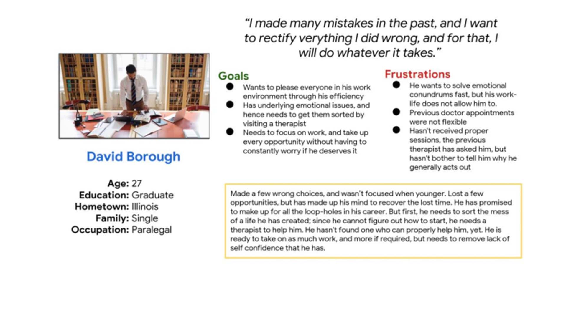
David Borough: Starting off his career
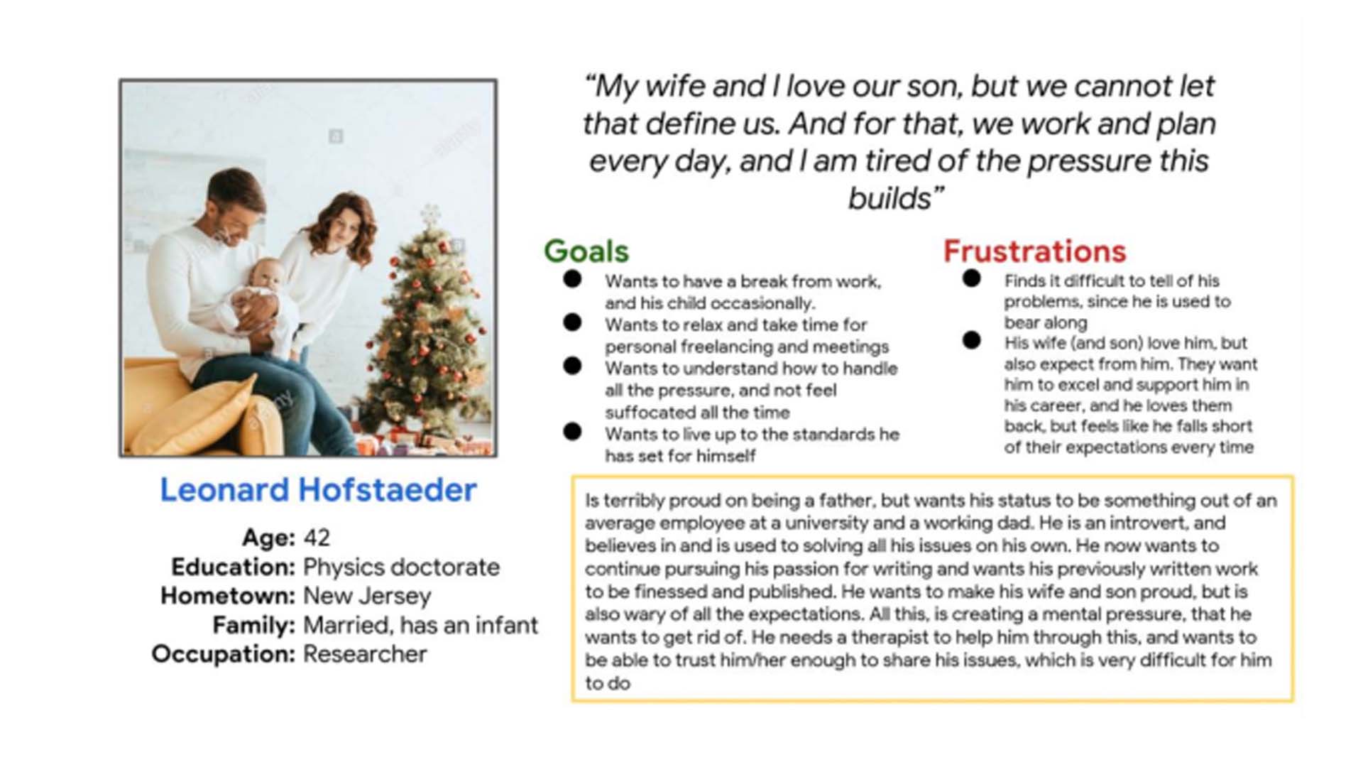
Leonard Hofstaeder: At the peak of his life
These personae helped me generate my problem statement: Create an application for users who are motivated to move forward in their life, but are finding it difficult to cope up with their fast-paced lives and careers; thus require the help of a professional to help them through this.
User Journey Maps
To understand the need for various elements based on the problem statement, I created User Journey Maps.
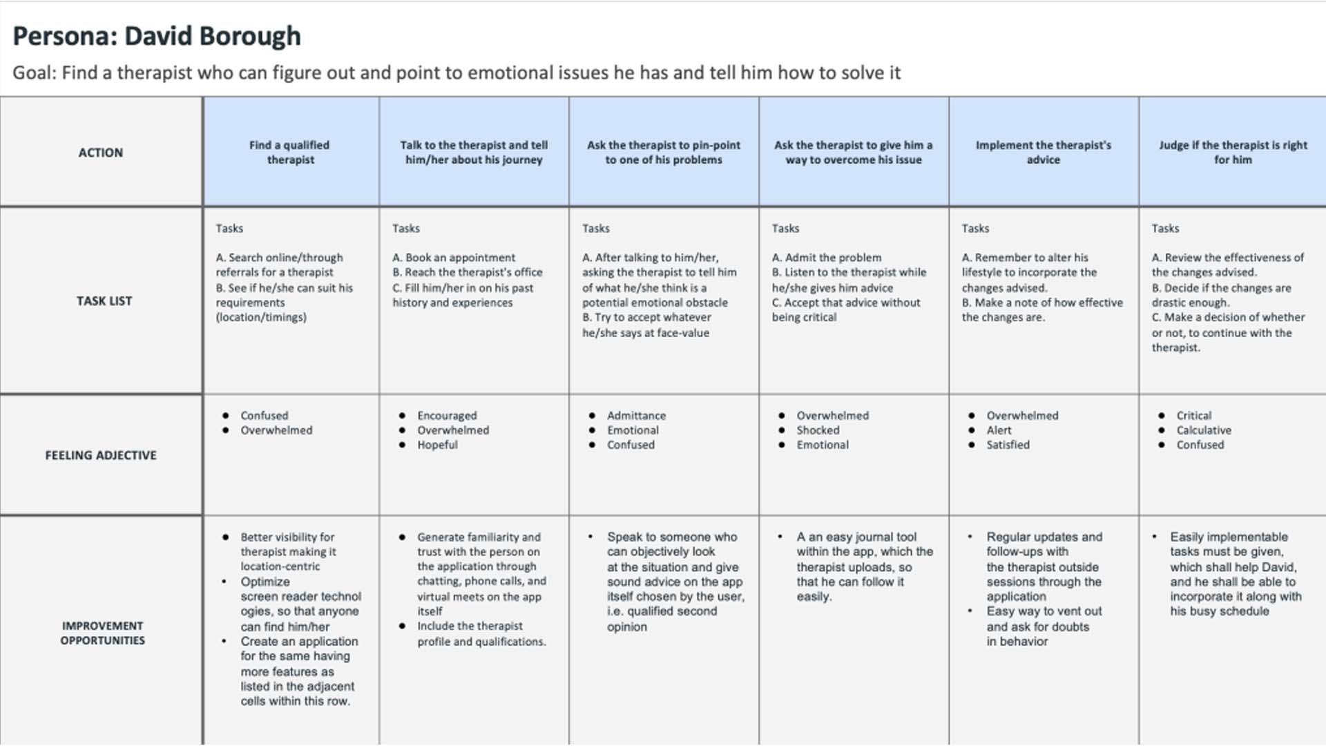
David Borough: User Journey map
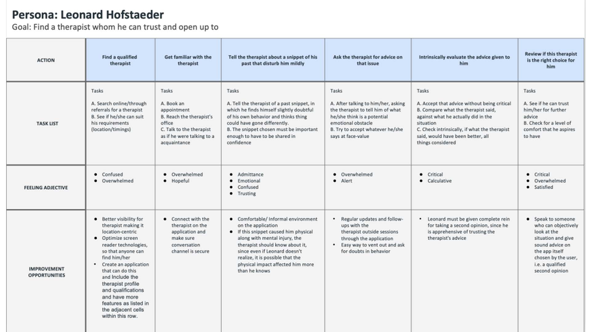
Leonard Hofstaeder: User Journey map
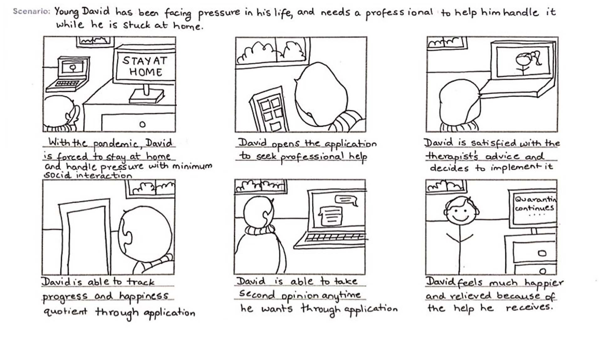
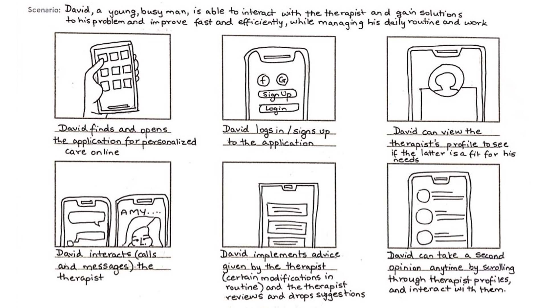
User Story Boards Big-Picture Story Board Close-Up Story Board
To understand the work-flow of the application based on the problem statement, I created User Story Boards.
Competitive audits:
Now that I knew what my problem statement was, I needed to check what was already present in this arena, and how I could serve my users better. I needed to determine, what worked, and did not work for other developers and designers; I learnt what to do and what not to do from them.
You can find my competitive audit report here and the audit here.
User Flow:
According to research and acquired knowledge, I created the following user flow
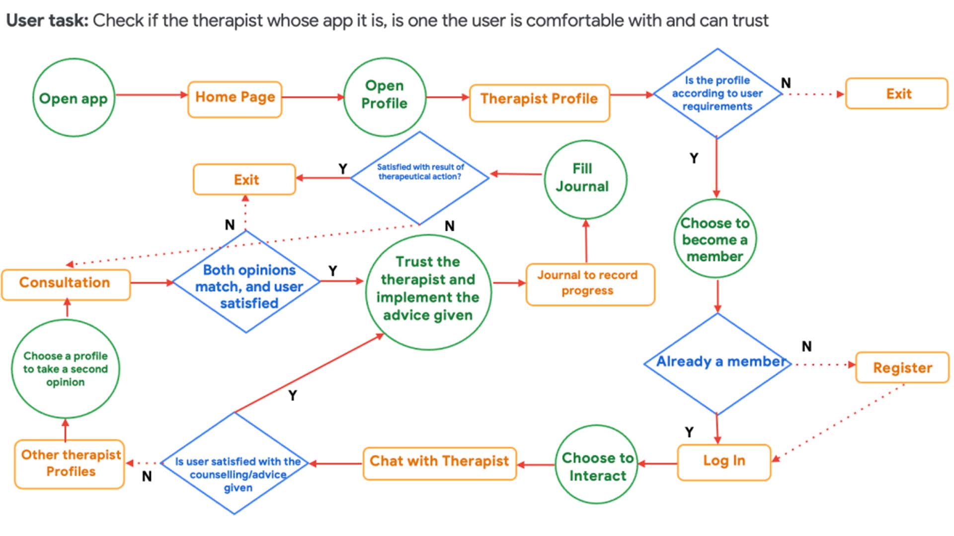
User Flow
Wireframes:
I chose to start with Paper wire-frames, despite being in lockdown, and I could not deploy it for testing because this helped me rapidly iterate, and discard ideas, that I felt were not suiting the application’s accessibility and usability.
Here are a few paper-frames:
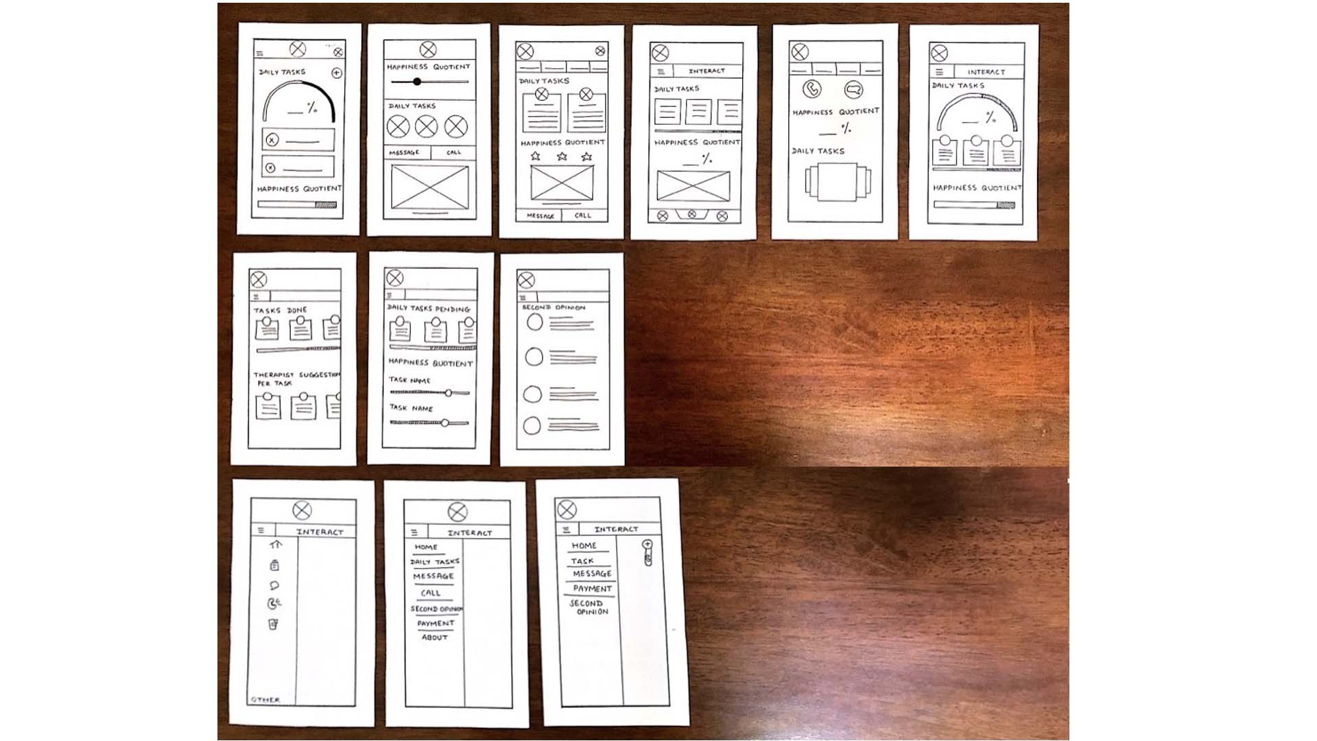
Samples of the Paper Wireframes
This is a rendition of an initial paper wireframe that I created, wherein the first row, are iterations of the final sixth screen.
Yet, I find, that as I further progressed, this design completely changed, and something altogether different was presented.
In order to finally test my design, I created digital wireframes. I am adding a couple of them here, with my thought-process behind it.
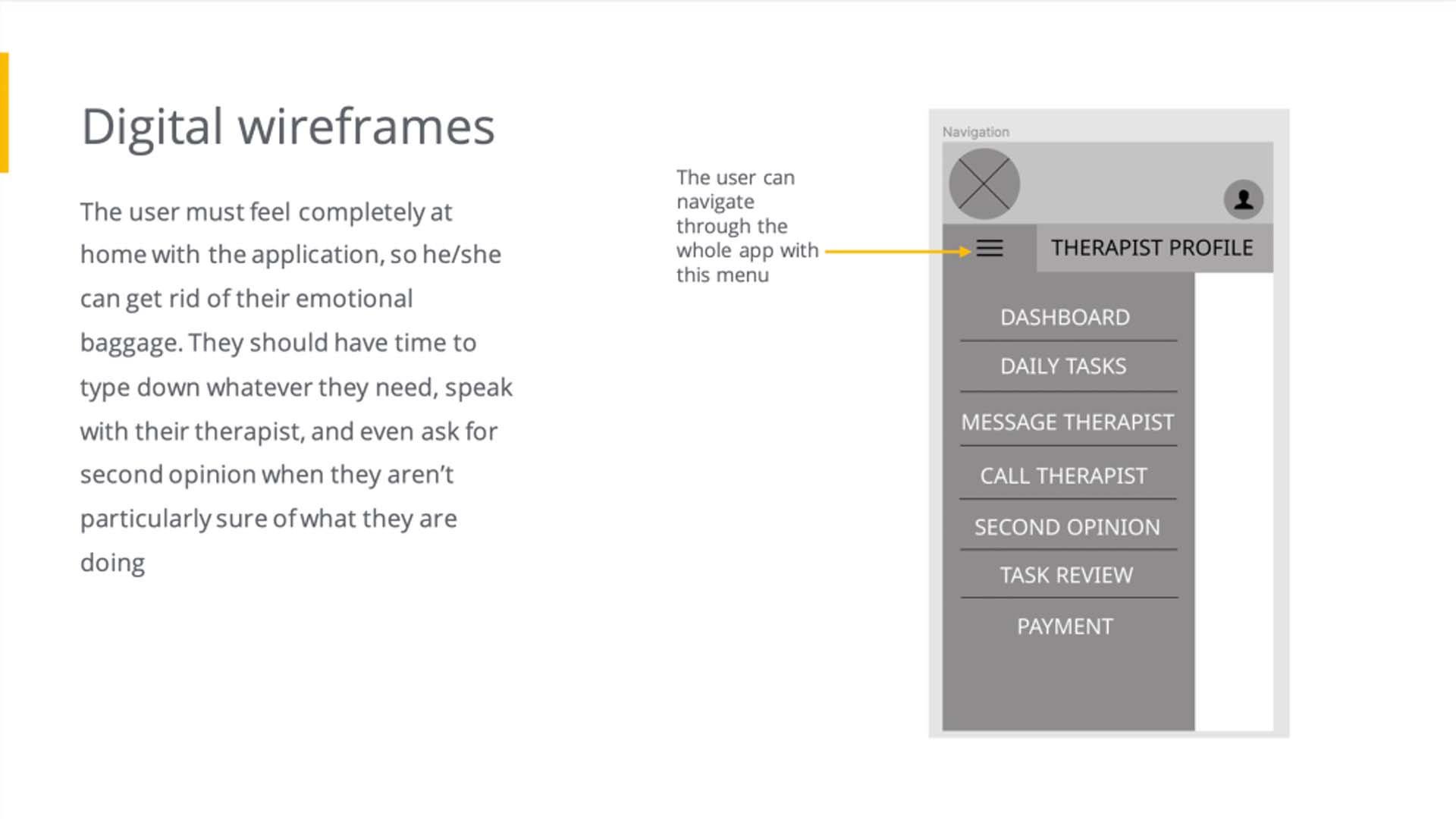
This is the navigation menu for the app
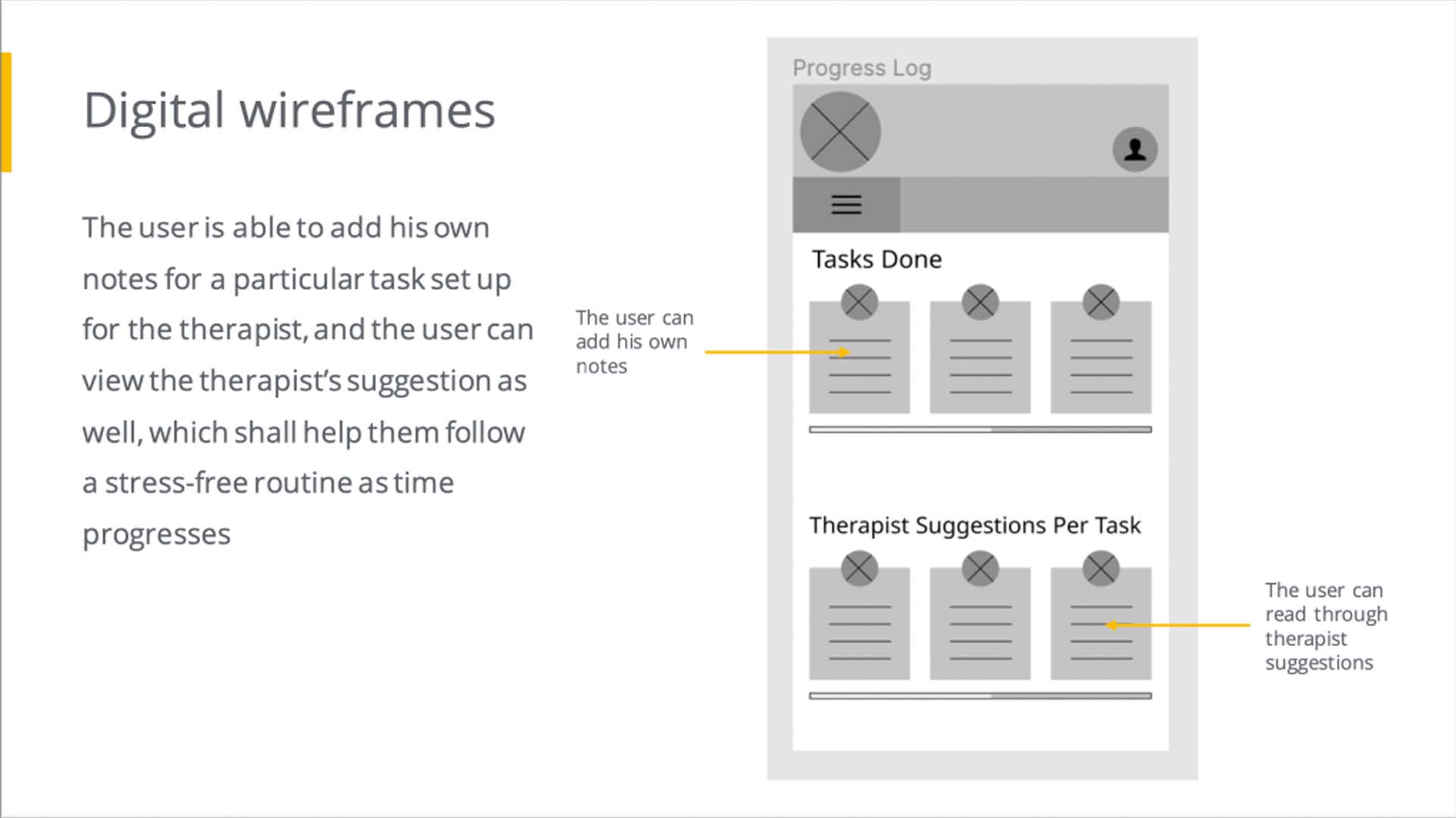
This is the Task Review Page: as originally envisioned
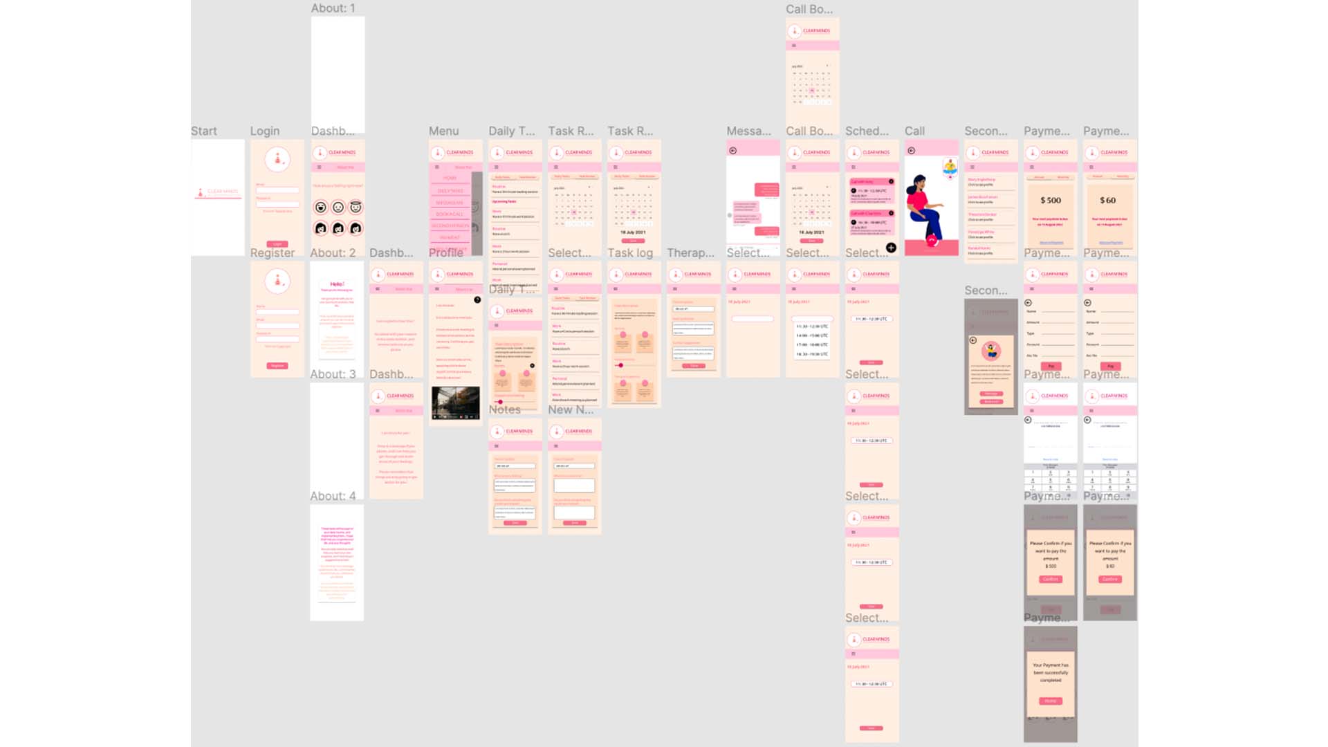
The wireframe generated the entire workflow of the application. It started from a start page, then go on to the login page or the register page, depending on if the user is new to the application or not. Then the user would go to the dashboard, and from the menu screen, the user can navigate throughout the app.
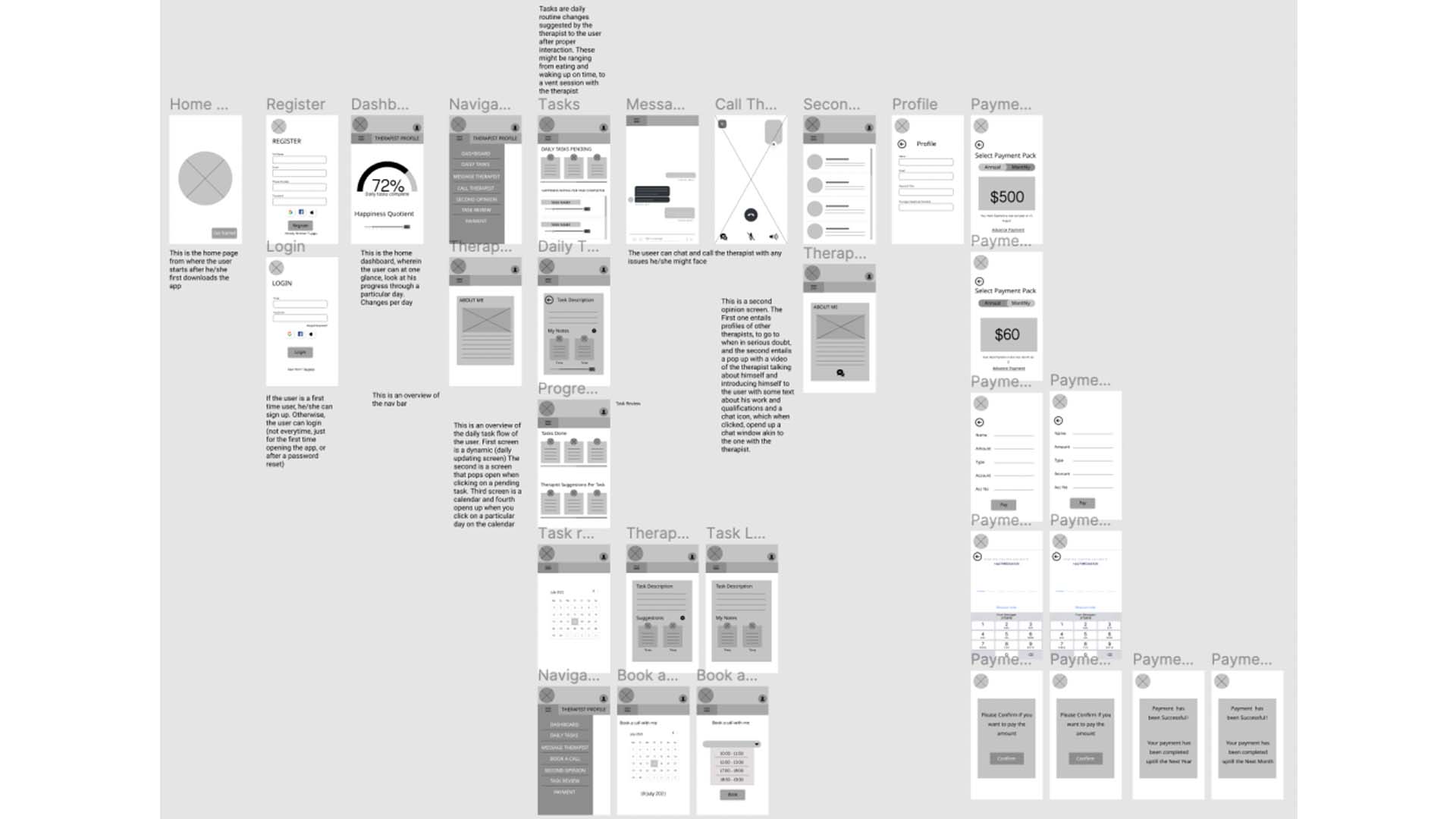
Complete wireframe as originally designed
You can view it from here
The features of the app include:
A dashboard, showing progress at a glance, and asking how happy the user feels at a given time.
A daily task board, which tells the user what to do throughout the day, and tells him the rating for every task
A Task review board, where the user can easily view all tasks done on a particular date (along with notes and therapist suggestions)
Facility to message and call the therapist
Option to take a second opinion
Payment subscription (annual/monthly)
Then I created a Lo-Fi prototype from these wireframes
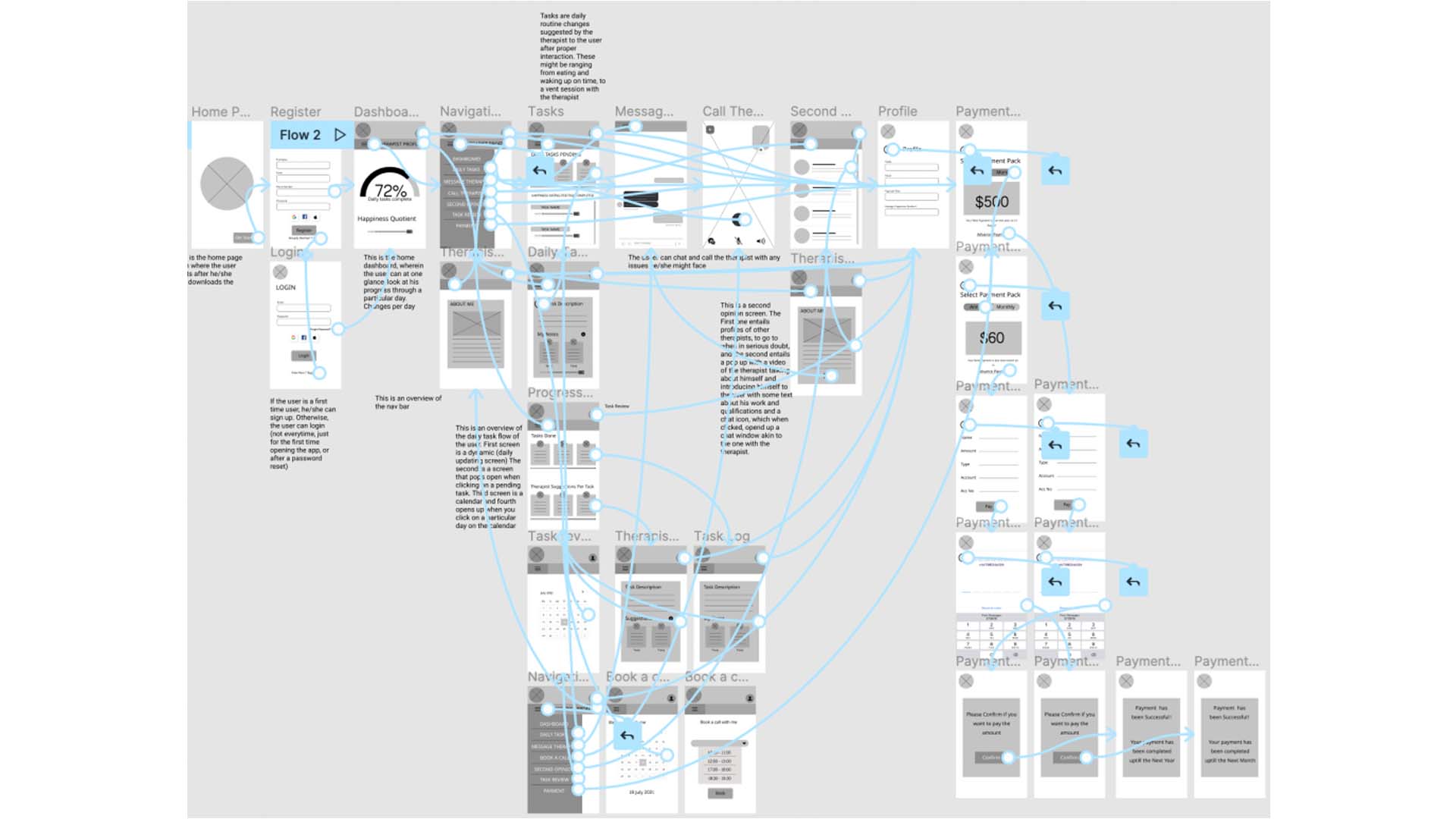
Lo-Fi Prototype
Usability Studies:
After creating the prototype, I tested it on selective users and conducted a study. You can view the study details and script here.
I further themed the feedback into an Affinity Diagram as shown below.
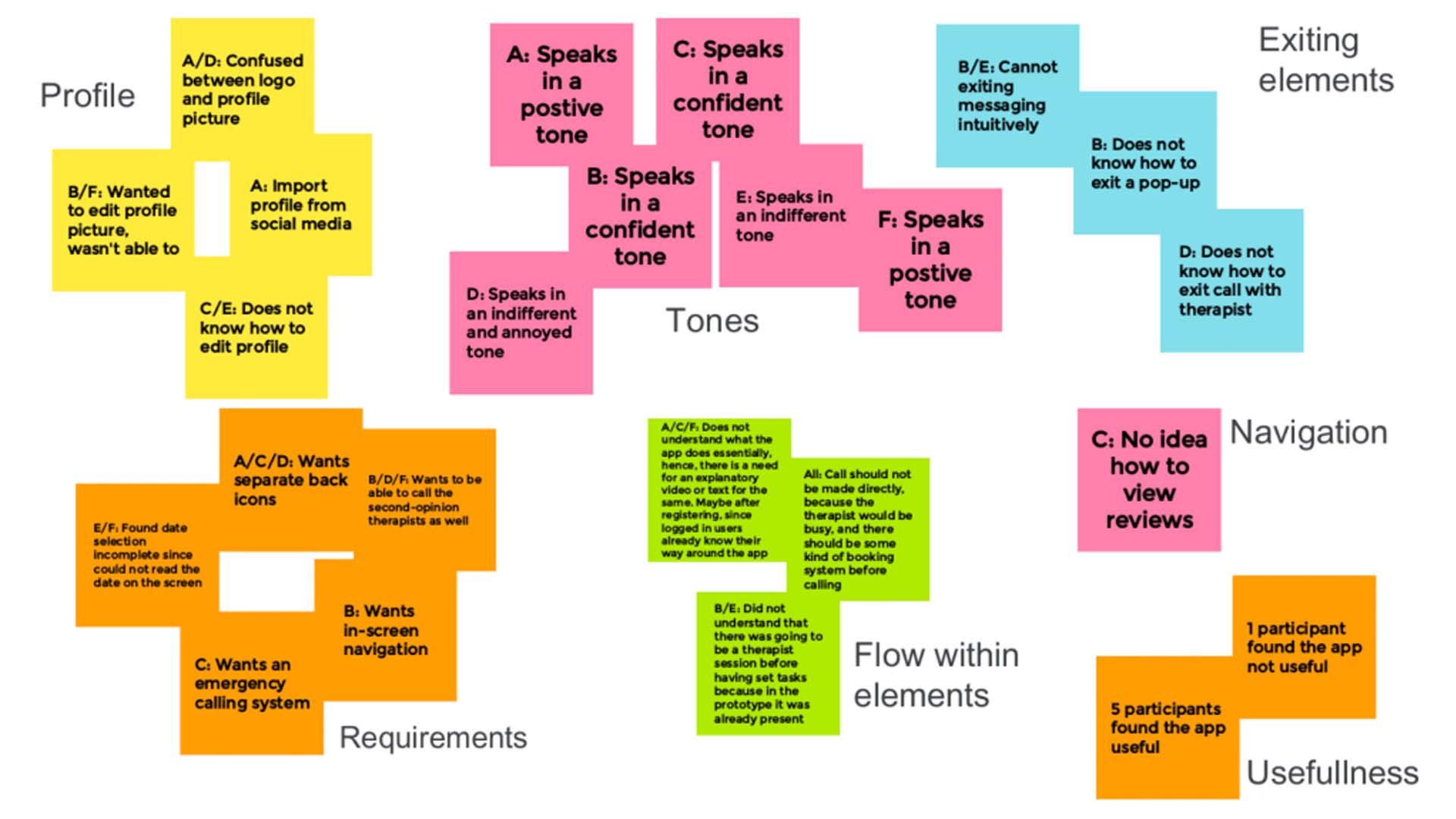
Affinity Diagram
This affinity diagram, helped me figure out themes, and patterns in the user feedback. You can view the study findings here.
These themes and patterns gave me ideas about how to change the wireframes, and better them, while creating mock-ups.
You can view the themes and patterns I found here.
I decided on what feedback to implement, and what feedback to leave, by discerning the number of participants who had the same problem, and if by making the modification, my user flow was getting disturbed or misbalanced.
Mock-Ups and Hi-Fi Prototypes
All that was left for me to do, was create mockups according to user feedback, and generate a hi-fi prototype. In order to do that, I had to create a high contrast and soothing colour-scheme, which I did.
I further themed the feedback into an Affinity Diagram as shown below.
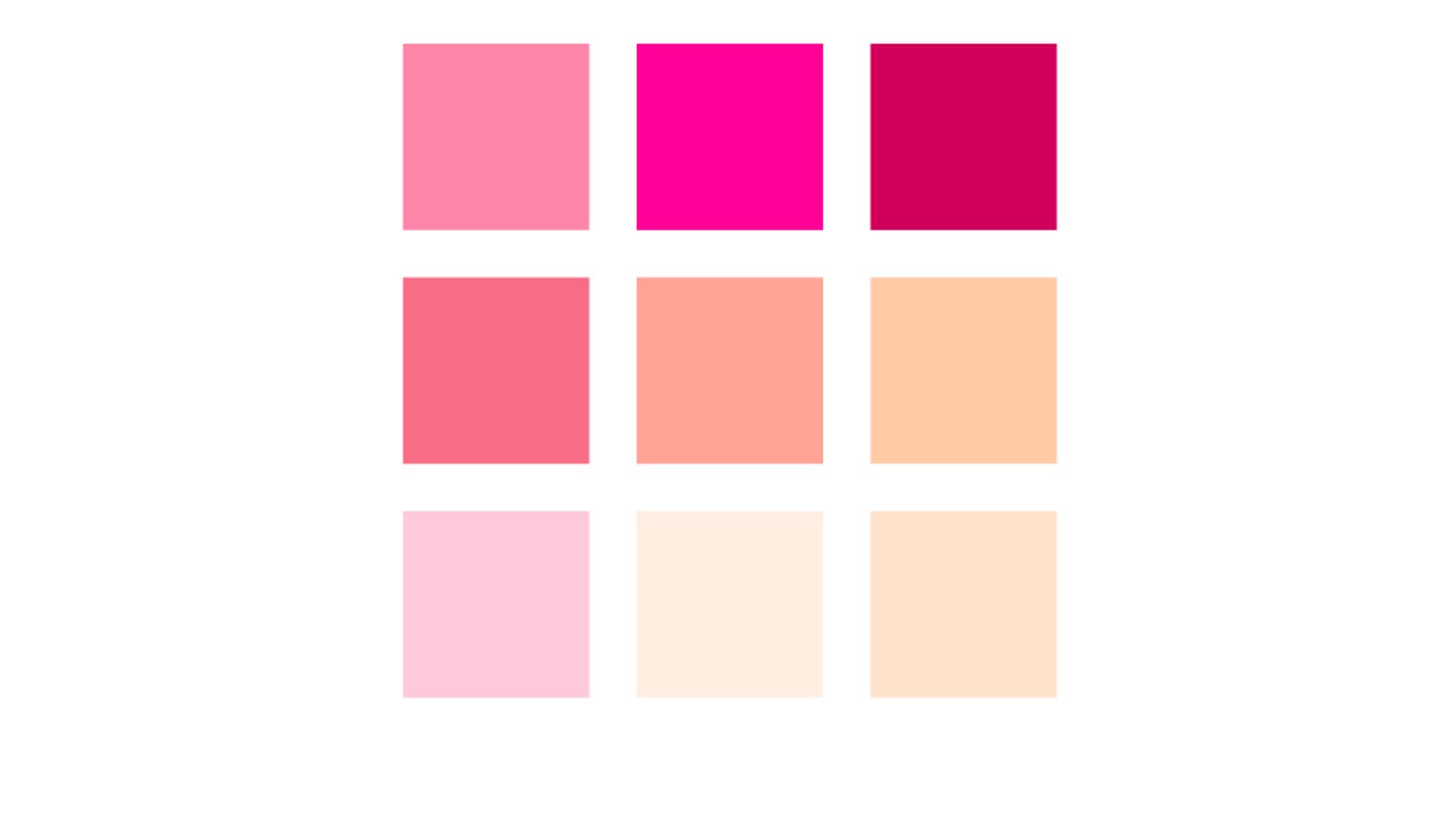
Color Palette
Further I went for a wide spaced typography, and which was easy to view. I also created a brand logo (for brand recognition), as shown below.
I further themed the feedback into an Affinity Diagram as shown below.
Brand Logo
I conducted three usability study findings throughout the process, one before designing the mock-ups details of which I explained above, and two before and after creating the Hi-Fi prototype. I am summarising the two:
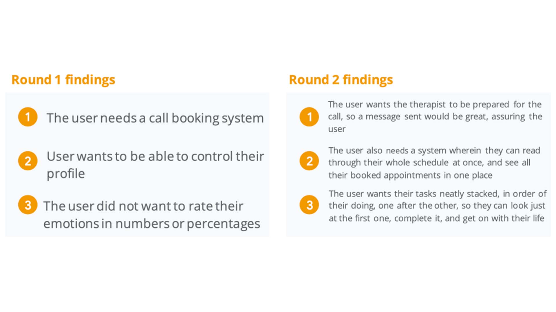
Study findings
During the third usability study a surprising thing happened when I was testing the mock-ups. Almost all users said they did not want a profile at all. When I asked them why, they said that since no external information is being recorded, and no details have been explicitly given, except for payment method, there is actually no need for a profile! This did not really strike me, and I am glad my study participants pointed it out. For the mock-ups below, I have already omitted the profile picture, and have elaborated on other findings.
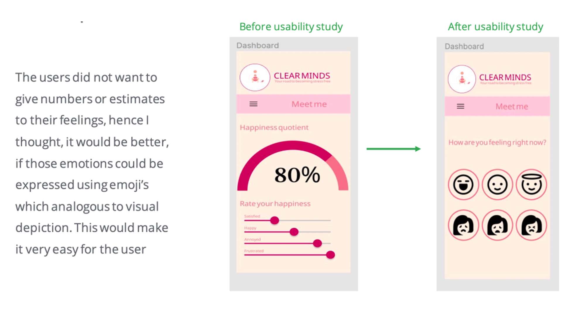
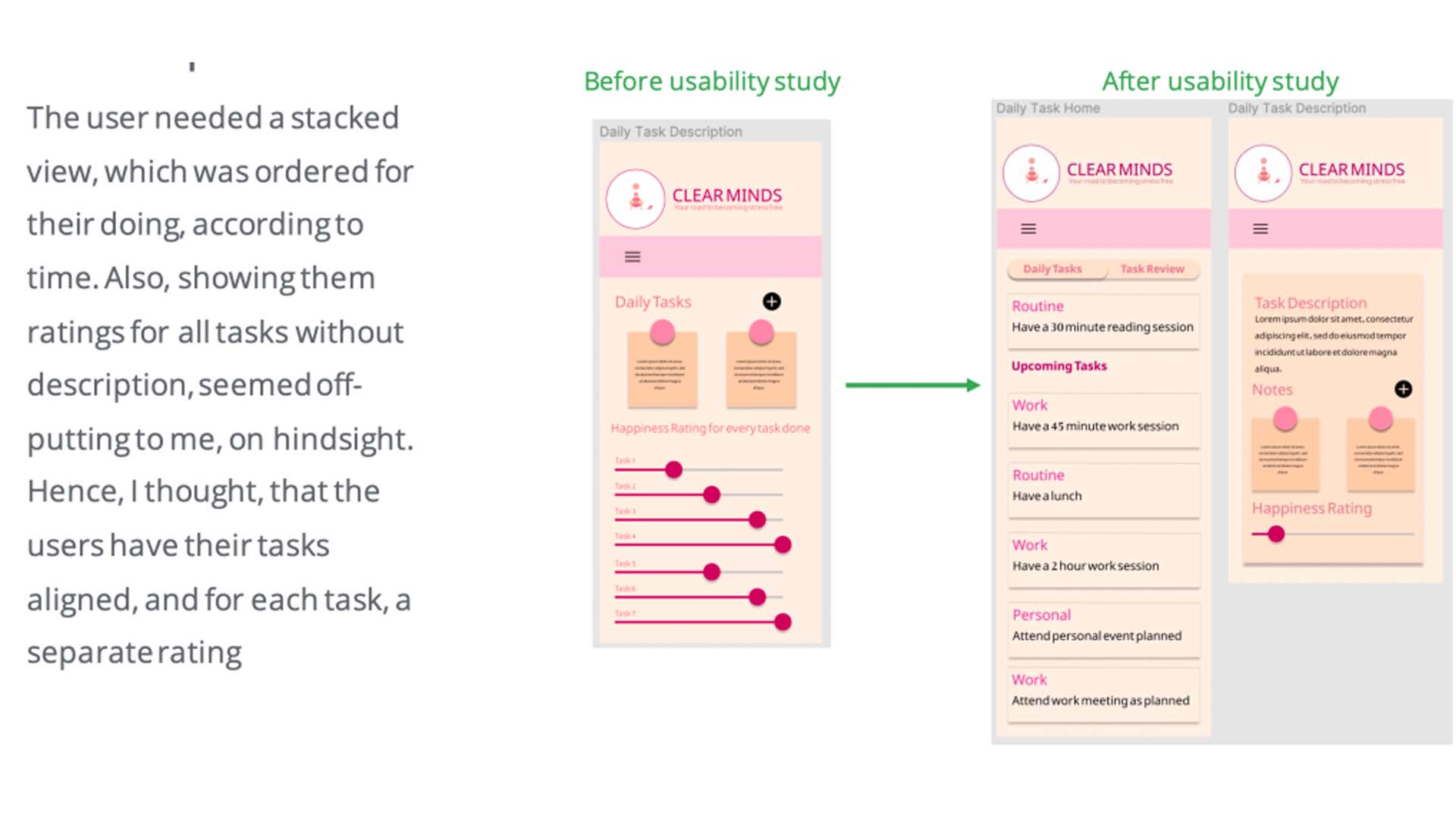
Complete Mock-Up. You can view it from here
Finally, I was ready to create my Hi-Fi prototype, as you can see below
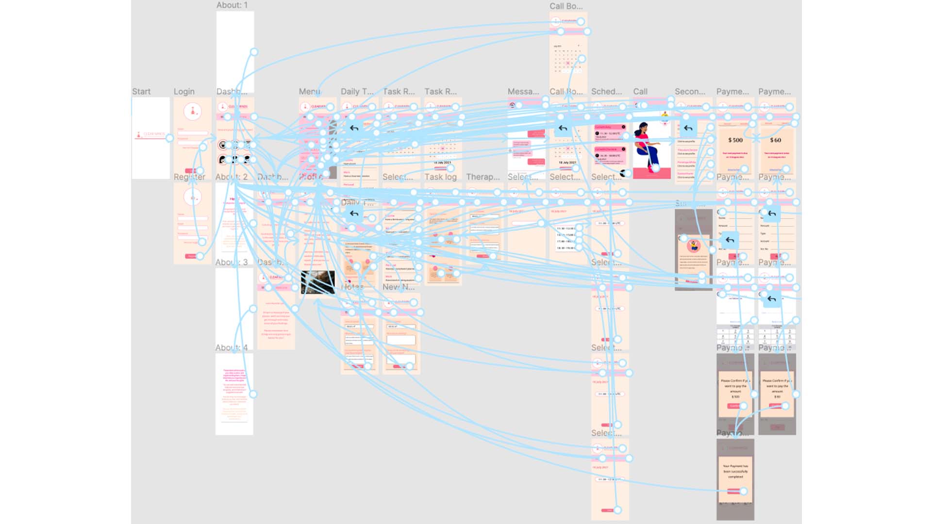
Hi-Fi Prototype
Accessibility Considerations:
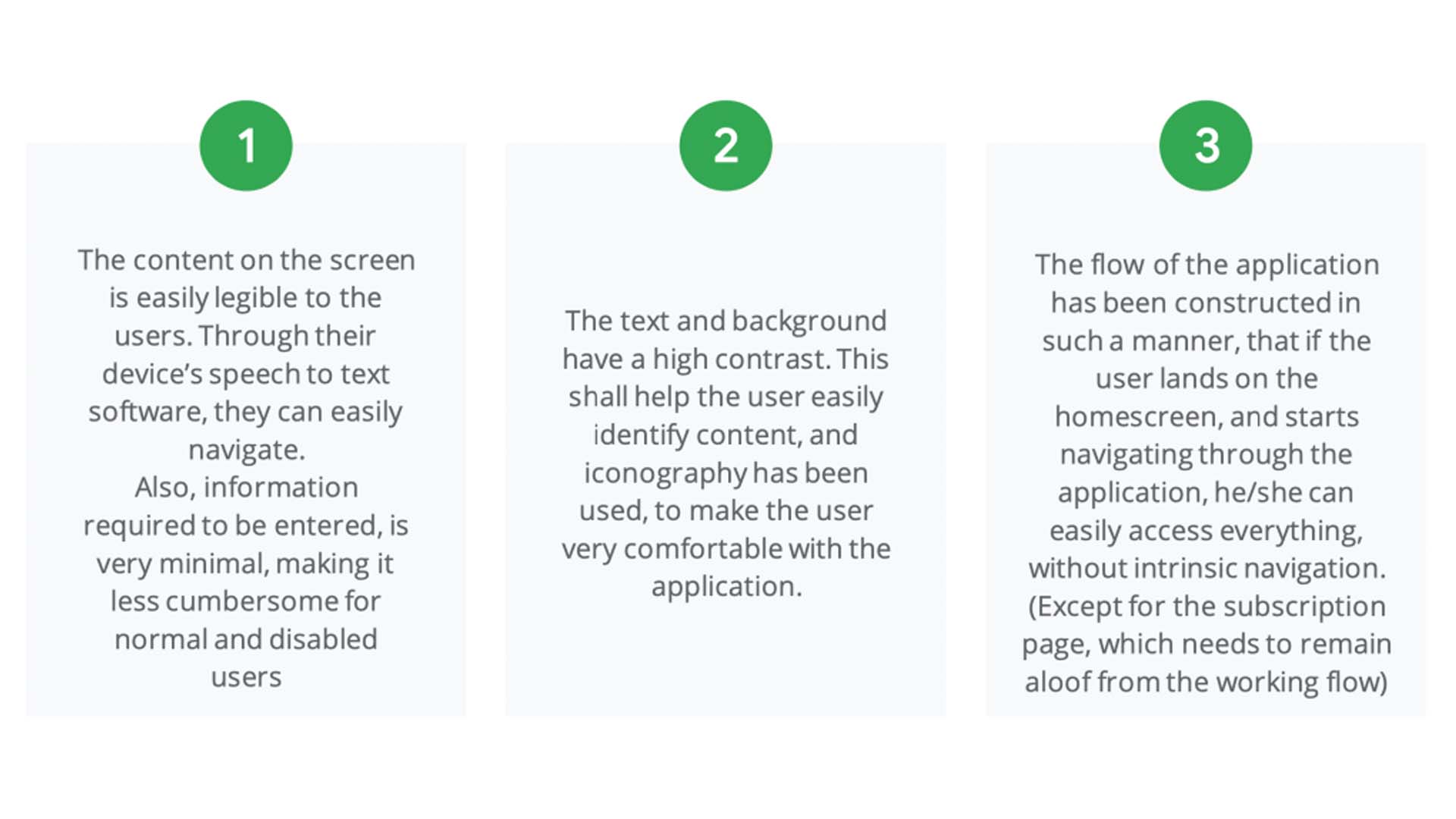
Accessibility Considerations
Impact:
After the final conducted usability study, participants said, that were very comfortable using the application. They felt no apprehension trusting the therapist, since she could explain herself, and her method of working to the user in a non-dominating fashion. Due to her constant presence, participants said they were inclined to become comfortable with the therapist much faster than they usually would be, in a real-life emulation.
What I learned:
Through this project I realized, that what designers think is best from a development perspective, might not be the best solution for the user’s problem. Constant interaction with the user is a crucial part of the design process. In spite of that, it is not necessary, that all feedback given from every user is a must-take, and implementation of better solutions must be done only after careful consideration and reflection.
Also, designers should be careful of not setting their heart on a particular feature or style, I can now endorse, that your design is going to change a lot 🙂 .
Additional research and Next Steps:
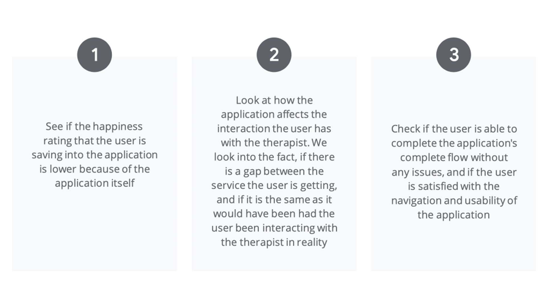
Next Steps
Thank you reading all the way unto here! I am really honoured that I captured your interest!
Back to Top
Back to Home
Clear Minds: Your Road to becoming stress-free